For some unfathomable reason, Bleeding Cowboys has become extremely popular. Barely a week goes by without it popping up on some vast billboard or ad reels on the pointless TVs in restaurants.
For those of you concerned with matters much less pointless who are wondering what I'm on about, which would be everyone, I'd think, Bleeding Cowboys is a ridiculously overstylised and hyperdecorative font. Aside from the sin of having such an awful name, it looks ridiculous and can be described, most generously, as mainstream indie. It is not in good taste. It is the visual equivalent of the taste of licking out the dumpster of extremely rich people, except with less class. It is the optical version of the foul smell of bad hospital smell air freshener which doesn't completely drown out the smell of urine. It is a lazy writer's dried sweat.
As you can probably tell, I am not very fond of Bleeding Cowboys. I hold what some might describe as irrationally strong views against it. Read it yourself; be the judge:

You can tell from this that this font is not intended for usage in sentences. It is highly unlikely that it is used even for one entire sentence by anyone apart from people who are busy exploring frontiers of OohFunkyFontLand.
Thus, experimentation aside, it's most common usage would be in single lines, like titles in movie posters or very very very bad books.
What led me to this rant is the apparently sudden discovery of this font by various hindi films.
At least 3 have come out recently that use it in their main poster. 2 using it for the title. It rankles me, nay, it infuriates me, to see this staring out at me from the vast posters above theatres and billboards ranging round the city and buses going infuriatingly by.
The culprits I noticed:

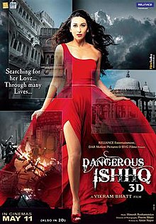
There are about 5 more variants of this poster, and ALL of them are rank with Bleeding Cowboys. Much like the Alamo.


While these are, in fact two different films, I counted them as one considering Raktabeej is a complete ripoff that is trying to profit by releasing at the same time as Rakhtbeej. Or vice versa. Point is, all their posters are riddled with Bleeding Cowboys, and as an added bonus it seems like my favourite celebrity Rakhi Sawant is doing an item number for one of them. Though I prefer her when she talks, rather than dances.

Honourable mention goes to whoever this is, who appears to have a tattoo saying 'MAIYA' on her hand, in, you guessed it, Bleeding Cowboys. Wow. And you thought a tramp stamp was bad.
http://a1.ec-images.myspacecdn.com/images01/120/5ca2aa05189dc6bed8df7d2e14cd3bab/l.jpg
Yes, rant over. But really, isn't it an awful font?
For those of you concerned with matters much less pointless who are wondering what I'm on about, which would be everyone, I'd think, Bleeding Cowboys is a ridiculously overstylised and hyperdecorative font. Aside from the sin of having such an awful name, it looks ridiculous and can be described, most generously, as mainstream indie. It is not in good taste. It is the visual equivalent of the taste of licking out the dumpster of extremely rich people, except with less class. It is the optical version of the foul smell of bad hospital smell air freshener which doesn't completely drown out the smell of urine. It is a lazy writer's dried sweat.
As you can probably tell, I am not very fond of Bleeding Cowboys. I hold what some might describe as irrationally strong views against it. Read it yourself; be the judge:
You can tell from this that this font is not intended for usage in sentences. It is highly unlikely that it is used even for one entire sentence by anyone apart from people who are busy exploring frontiers of OohFunkyFontLand.
Thus, experimentation aside, it's most common usage would be in single lines, like titles in movie posters or very very very bad books.
What led me to this rant is the apparently sudden discovery of this font by various hindi films.
At least 3 have come out recently that use it in their main poster. 2 using it for the title. It rankles me, nay, it infuriates me, to see this staring out at me from the vast posters above theatres and billboards ranging round the city and buses going infuriatingly by.
The culprits I noticed:
There are about 5 more variants of this poster, and ALL of them are rank with Bleeding Cowboys. Much like the Alamo.
While these are, in fact two different films, I counted them as one considering Raktabeej is a complete ripoff that is trying to profit by releasing at the same time as Rakhtbeej. Or vice versa. Point is, all their posters are riddled with Bleeding Cowboys, and as an added bonus it seems like my favourite celebrity Rakhi Sawant is doing an item number for one of them. Though I prefer her when she talks, rather than dances.

To be fair to Yeh Khula Aasmaan, this is the only poster which uses Bleeding Cowboys, and it is used for only one word out of the many written. That said, who on earth thought it was a good idea to have the word SUCCESS in this awful font? Clearly whoever was making the poster was trying to include as many fonts as possible. I just think that even Times New Roman would be better used here. But apart from SUCCESS, this poster seems mostly nice. Ish.
http://a1.ec-images.myspacecdn.com/images01/120/5ca2aa05189dc6bed8df7d2e14cd3bab/l.jpg
Yes, rant over. But really, isn't it an awful font?

No comments:
Post a Comment